BLOG
How to Choose Colors and Fonts that Fit Your Brand
“Design first starts with typography” says Chris Do, an Emmy award-winning designer and founder of The Futur.
By Laura Halsel, Graphic Designer
With over 16 million color combinations and 100,000 plus font choices, choosing a few to define your brand can be overwhelming to say the least. When done well, the fonts you choose for your website or marketing materials can help the reader understand the material and get a sense for your brand’s identity. When chosen poorly, your communications may do more harm than good.
Luckily, there are a few basic guidelines that can help…
How to Choose a Font for Your Brand
Fonts can be sorted into many different categories or styles, such as sans serif, serif, slab serif, and handwriting. The two most common, broad categories are serif and sans serif.
Serif fonts, like Times New Roman, Gothic, or Georgia, can be described simply as fonts with extra strokes on the ends of each letter, which are sometimes called “feet” or “tails”. Sans serif fonts, like Arial or Calibri, do not have the extra strokes and often look more clean and simple.
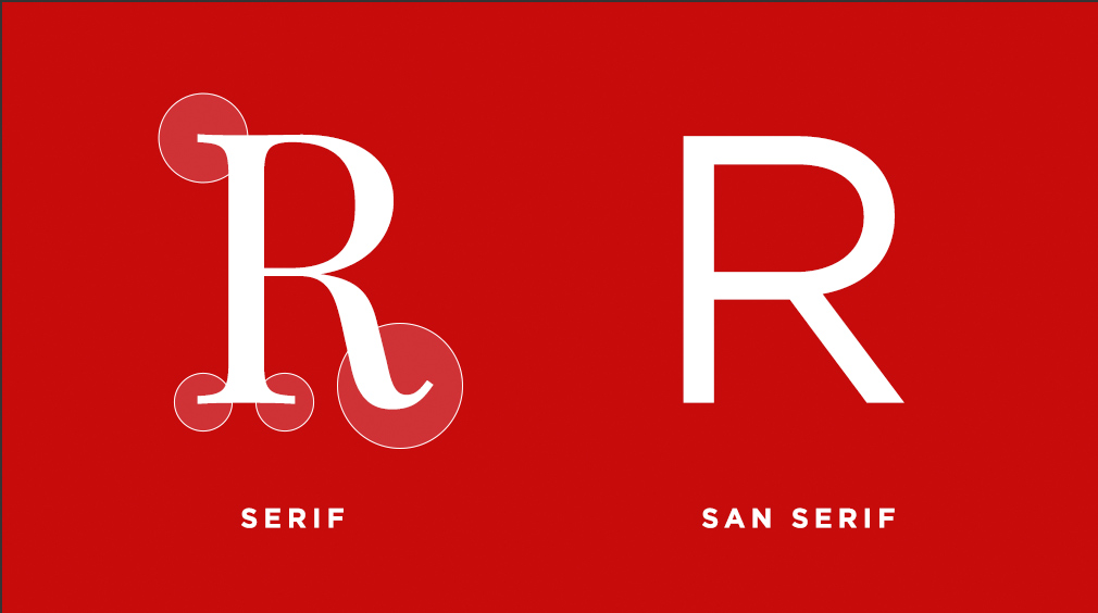
Generally, sans serif fonts are used to depict a modern, clean, and contemporary look and feel, while serif fonts can illustrate history, reliability, and tradition.
In addition to the basic font categories, there are also a few other key considerations when choosing fonts for your brand:
- Font Size: It’s important that the font you choose is easy to read in both large and small formats, especially if it may be viewed on a mobile device.
- Weight: Sometimes choosing a thin sans serif font, or a particularly bold font, can be hard to read if used as body copy in large paragraphs. Consider using those styles in shorter, larger headlines, so legibility is not an issue.
- Contrast: When pairing different fonts, it’s also important to maintain contrast and create a common hierarchy. A good rule of thumb is to use no more than three fonts for any given brand, not only to create an appealing design, but to guide the reader through the information. You’ll want to make sure headlines are easily distinguished from subheads and body copy, for example.
- Tone: The tone of your brand and chosen fonts can be more subjective, but you’ll want to keep in mind how font styles might be portrayed. A law firm, for example, might not be an appropriate place to use a playful, curly font like Curlz MT or Comic Sans.
As you continue your exploration of font styles, be sure to utilize resources such as Google Fonts, which offers a vast number of free fonts, as well as suggestions for pairing different fonts.
How to Choose Brand Colors
Once you’ve selected fonts, you’ll need to decide what colors to use for each, and much more thought goes into that process beyond which colors simply look nice together.
There’s an entire science called Color Psychology. Each color conveys a certain type of emotion and can be closely tied to personal experiences, often causing people to actually feel particular emotions. For example, studies have shown that the color red conveys desire and can even make us hungrier, which is why so many fast food logos are a mix of red and yellow (i.e. Wendy’s, McDonald’s, Pizza Hut).
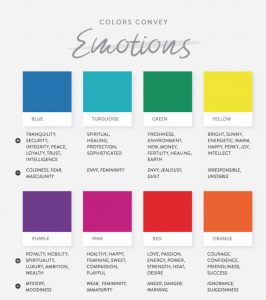
In healthcare, many companies use blue and green because blue signifies stability, confidence, and trust, while green conveys health, eco-friendliness, and nature. In contrast, purple represents royalty, wealth, and sophistication.
Colors also play a significant role in brand recognition. In fact, color has been shown to increase brand recognition by 80% (KISSmetrics), which directly links to consumer confidence.
When creating your brand, you’ll want to choose one dominant or primary color to use throughout your website and other materials. This color is typically used wherever you want your viewers to focus or take action. The next step will be choosing secondary and tertiary accent colors, which you can use to highlight additional information and add visual interest. Similar to fonts, it’s important to limit the amount of colors you choose to avoid confusing or overwhelming the audience.
In the end, much of branding comes down to consistency — sticking to the fonts and colors you choose throughout your marketing materials. Keep in mind the tone and image want to portray and make decisions that continually further the brand.