BLOG
How to Create a Simple, Beautiful PowerPoint Template
By Laura Halsel, Graphic Designer
PowerPoint: a daunting word that can make the hair on the back of your neck stand up. Whether you’ve used it for years or try your best to avoid it, there are some proven best practices that can really help make it easy and fun to create something beautiful for your brand.
Even the most design-averse members of your team have likely dabbled in PowerPoint once or twice, making its universality a great option for early-stage startups and small businesses to leverage as they establish their brand — especially for those without a dedicated marketing professional on hand, let alone an entire creative team.
From sales pitches to product demos to investor conferences, the need for presentation decks across your organization can grow rapidly as you make your mark in any industry, so the development of a standard template is key.
Setting Up a PowerPoint Theme
First and foremost, when creating a new document, it’s crucial to set up a theme before you even consider adding content or design elements.
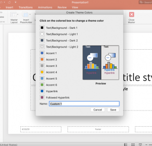
A PowerPoint theme allows you to customize colors, fonts, and other visual elements for consistency across the entire deck. It can also make your life a lot easier if you’re planning to share the presentation or collaborate with other members of your team.
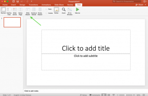
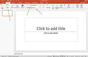
You can access the theme a few different ways, but we recommend starting with the Slide Master by clicking “View” then “Slide Master View.” (These options may vary slightly depending on your device and the version of PowerPoint you’re using.)
By setting up the Slide Master, you can maintain control of the deck’s design elements even if you grant other team members access to edit the presentation. This cuts out the hassle of importing colors, changing fonts or other tedious and unnecessary extra work. Ideally, your organization will set up one or two overarching PowerPoint themes with various slide layouts to be used consistently as templates throughout your organization. This will eliminate a lot of headaches and edit rounds as your business establishes and maintains its brand.
Editing the Slide Master
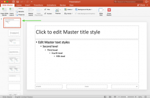
The Slide Master controls the theme, layout, background, colors, fonts, and positioning of all the different types of slides. By enabling you to create multiple layouts and designs for various use throughout your presentation, the Slide Master makes it easy to drop in content as you go.
In Slide Master View, the left preview panel will show one large slide (the Slide Master) with several smaller variants of slide layouts beneath it. These are commonly used layouts, which PowerPoint includes by default, but you can edit, add or remove them as needed from this view. Whatever you adjust on the larger slide will be automatically applied to the rest of the slides beneath it. It’s a great place to add slide numbers, dates, logos, headers, footers or anything you would like to include consistently across all slides.
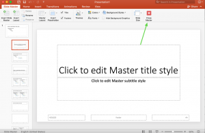
After you’ve made all your edits to the Slide Master, select “Close Master” to apply your changes and go back to the Normal presentation view. From there, you’ll be able to add new slides as needed by choosing from the various layouts you just created.
Selecting Fonts & Font Sizes
When it comes to font styles, it’s important to remember that your fonts need to be compatible across devices and operating systems to maintain design consistency — regardless of who opens the presentation. System fonts are not the same across all devices. If you choose a font that’s native to Mac users, for example, but not to Windows, then a Windows OS may replace your chosen font with another, somewhat similar font by default or worse: display a string of nonsensical characters and symbols instead. This can be super frustrating if you’ve dedicated the time toward designing a beautiful brand — only to have your work get lost and replaced along the way.
The key is to select fonts that are either basic, shared fonts like Arial, or to be sure to send font files along with the PowerPoint file to anyone who might open the presentation on their own device. Each user will need to download and install the custom font files before opening the PowerPoint file for the first time. Here’s more information on how to install fonts on a Mac and how to install fonts in Windows.
In addition to selecting the right typeface, it’s also important to make sure your font is the right size. To ensure legibility on all screen sizes, the best practice is to adjust headlines to size 32 or above and body copy to at least 24.
Inserting Charts, Tables & SmartArt
Once your theme, fonts, and colors have been set, you can begin setting up other important elements, such as diagrams, copy, and imagery. In terms of charts, tables, and SmartArt, our rule of thumb is “If you can make it in PowerPoint, you should.”
For example, if you want to include a diagram on a particular slide, you may be tempted to create it in Adobe Illustrator, Microsoft Excel or a different program, and then import to PowerPoint. Although you may have more flexibility and familiarity in other programs, you might also have team members who don’t work in those programs, leaving them unable to make any edits to those visuals as needed.
It’s also important to keep file size in mind. Importing images, even at smaller file sizes, will continue to increase the size of the PowerPoint file, which can make it difficult for certain users to open or send via email. Large file sizes will also increase load time, causing awkward delays during presentations.
Luckily, PowerPoint includes a variety of ways to set up native charts, tables, and SmartArt, so you can create diagrams that are easy to edit while keeping file size to a minimum.
Creating Simple, Beautiful PowerPoint Slides
When you’re ready to add images, text, transitions, and/or animations, keep simplicity and readability in mind. You may have the urge to make things as flashy as possible — but you should fight that urge. It’s important to keep your slides clean and easy to read on all screen sizes, from a smartphone or tablet to a desktop computer or conference room projection. The purpose of the presentation is to tell a story and provide fluidity between each slide. You’ll only confuse the audience if you have too much going on at once. Flesh out content onto multiple slides so the reader doesn’t lose interest.
Saving Multiple Versions & Backups
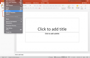
Finally, an obvious yet all-important tip is to save often as you go. Start by saving a clean version of the template once you’ve finished setting up the Slide Master, then create copies to save separately for each new presentation using that theme.
Corrupted PowerPoint files caused by system or user errors are not uncommon on Windows or Mac, so having a backup will save yourself the frustration of starting from scratch.
Whether you have a marketing team of ten or a lonely intern dedicated to designing a consistent look and feel, follow these simple tips to ensure your brand is consistent, beautiful, professional, and powerful throughout every presentation from your team.